Stellantis Reworks Citroën Brand Logo & Slogan As It Enters Electrification Era!
Marks 10th Major Refresh For Logo Since 1919...
Stellantis’ 103-year-old French Citroën brand has unveiled a new logo and a new brand identity, marking the beginning of a new modern, and dynamic era for the brand. With this new identity, Citroën says it shows the brand’s willingness to accelerate its mission towards e-mobility.
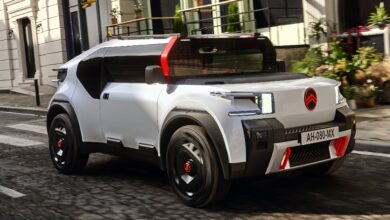
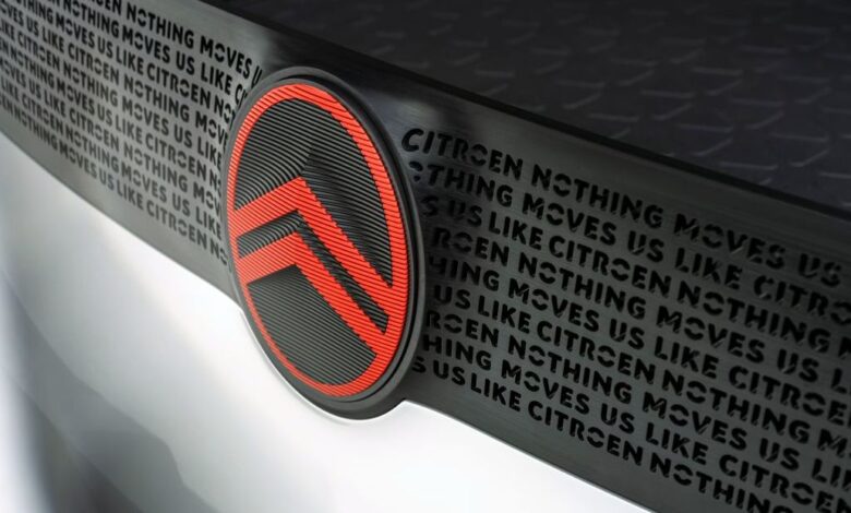
The elegant new emblem, which marks Citroën’s transition and evolution toward the new era, will be presented at the end of September on a concept car that represents a true direction for the future of the brand. It will also be progressively declined in future production cars and future Citroën concept vehicles, starting from mid-2023. The vertical oval, accentuated and enhanced, will introduce a new direction to the design language. More visible, it becomes a distinctive, instantly recognizable signature feature of all Citroën models.
The new logo also will be accompanied by a new slogan for the brand, “Nothing moves us like Citroën“.
“As we embark on probably the most exciting chapter in our illustrious 103-year history, the time is right for Citroën to adopt a modern and contemporary new look,“ Vincent Cobée, CEO of Citroën. “Our new identity is an elegant symbol of progress as we move our customers physically in daring, forward-looking vehicles that challenge traditional industry rules, and emotionally by ensuring their entire experience – particularly going electric – is more affordable, comfortable, and enjoyable whatever their wants and needs. Our legacy of inspiring consumers with daring and revolutionary vehicles is energizing us to adopt a different, more inclusive approach to future family mobility, and we firmly believe that customers past, present, and future will agree that nothing moves us like Citroën.”
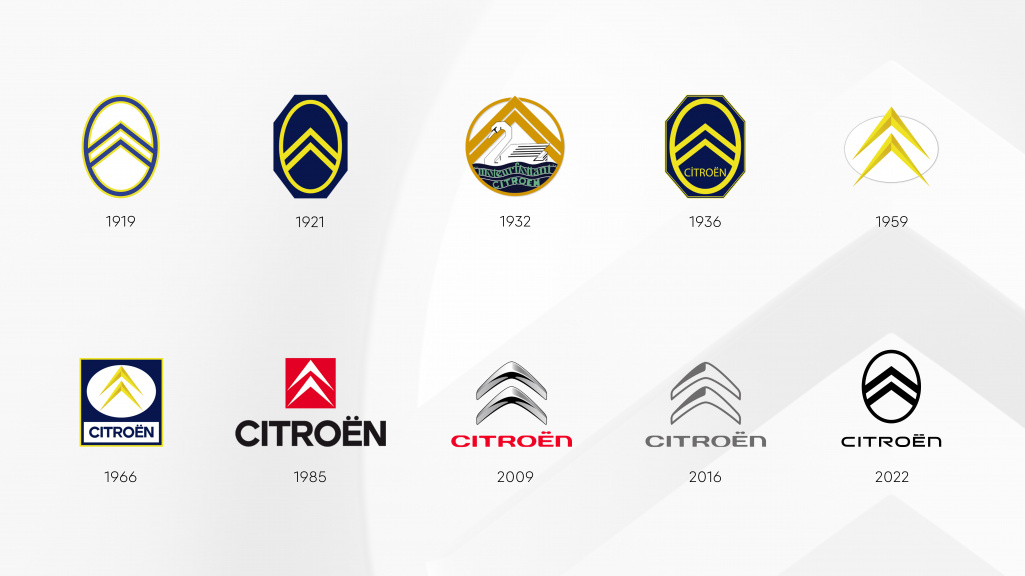
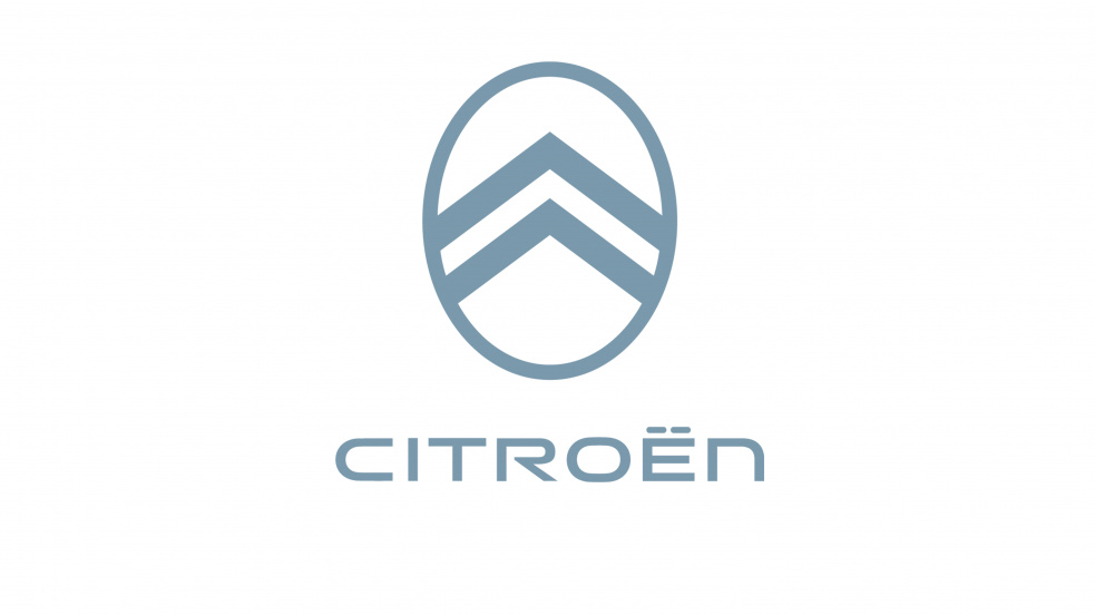
The change marks the 10th major revamp of the Citroën logo since the company’s creation in 1919 and features wider and more prominent chevrons, contrasting with a thinner vertical oval frame surrounding them.
“At a time when we intend to clarify our future goals, it was logical for us to graphically recall the first André Citroën logo, which represented the authentic promise of accessible and innovative mobility for all,“ said Alexandre Revert, Citroën Global Brand Designer. “The progressive transition to a more evident and visible institutional signature is a significant, albeit subtle, evolution in which the precision of the technical and functional ‘chevrons’ creates a contrast with the warmth and almost human sweetness of the oval that surrounds them.“
“By embracing our roots and reinterpreting our identity in a modern way, we are sending a clear message to everyone: we remain faithful to the spirit of Citroën, changing the status quo,“ stated Laurent Barria, Citroën Marketing and Communications Director. “Backed by our mission to create bold solutions that make electric mobility more accessible, we continue to look at things differently and are determined to show our customers and ourselves that no one and nothing transports us as Citroën does. Thanks to this new identity, we want to extend the emotional well-being we experience inside our cars even outside the car, through the entire path that customers undertake with us.“

Developed by the Citroën design team, the new brand identity benefits from the experience of the Stellantis Design Studio and Stellantis’ Global Brand Design agency.
