
Mopar Unleashes New 807 Horsepower Hellcrate Redeye Crate Motor:
And Yes, You Can Opt For A Manual Transmission...
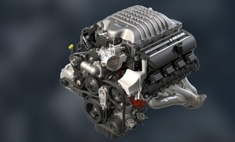
It seems like every year during the Specialty Equipment Market Association (SEMA) show in Las Vegas, the Mopar brand unleashes another new crate motor for performance enthusiasts to drool over. With the SEMA show being canceled this year, the organizers have gone digital with its SEMA360 platform and Mopar isn’t holding back with its newest crate motor the “Hellcrate Redeye”.
Instead of using the standard Hellcat Redeye powerplant specifications, this motor will feature the same ratings as the new 2021 Dodge Challenger SRT Super Stock. That means this motor will produce 807 horsepower and 717 lb.-ft. of torque on 91-octane pump gas.
“With the addition of this new supercharged HEMI, Mopar now offers five HEMI crate engines with a range of 375 to 1,000 horsepower,” said Mark Bosanac, Head of Mopar Service, Parts and Customer Care for FCA – North America. “All Mopar crate engines are quality-tested and factory-backed to deliver proven performance to our enthusiasts.”
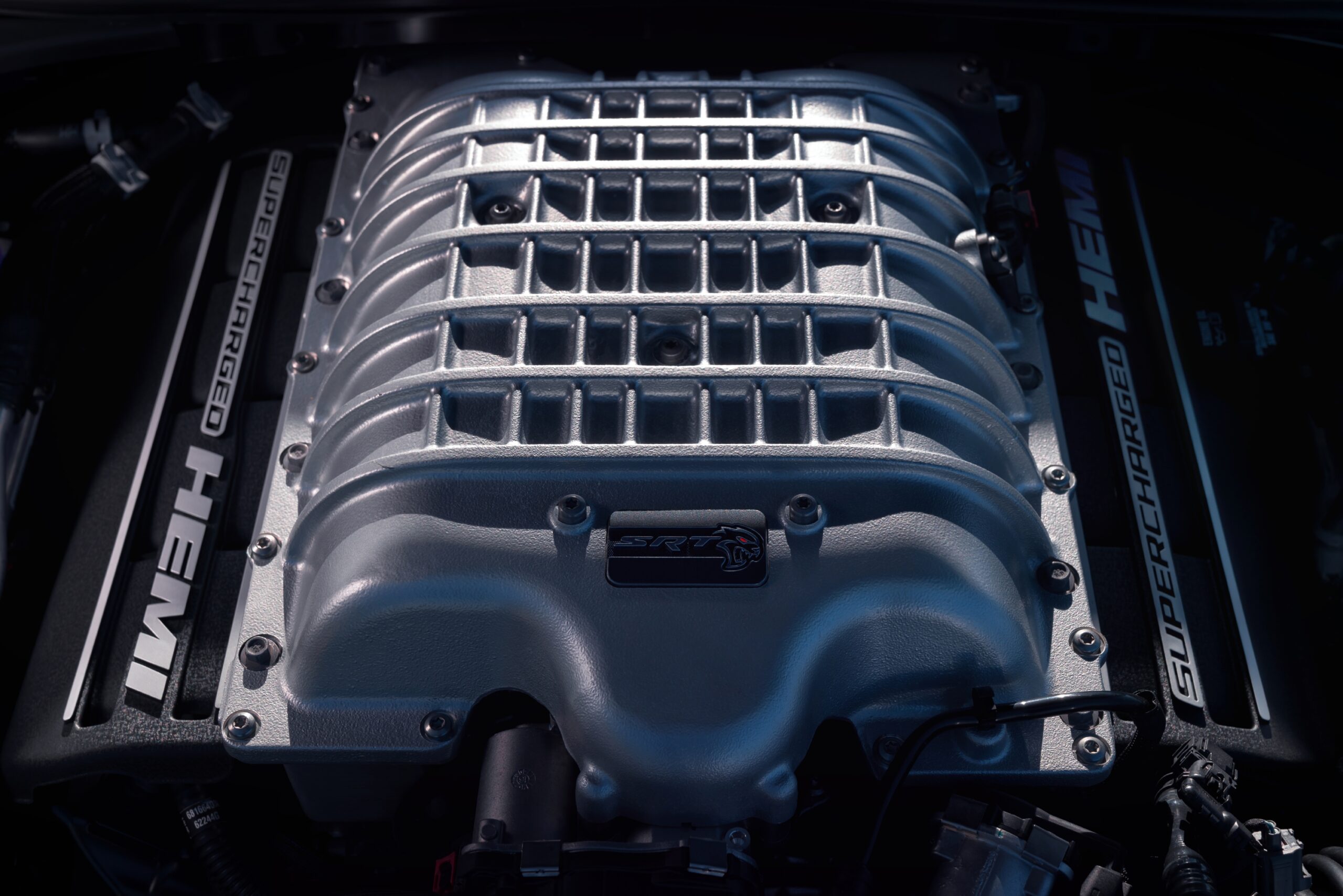
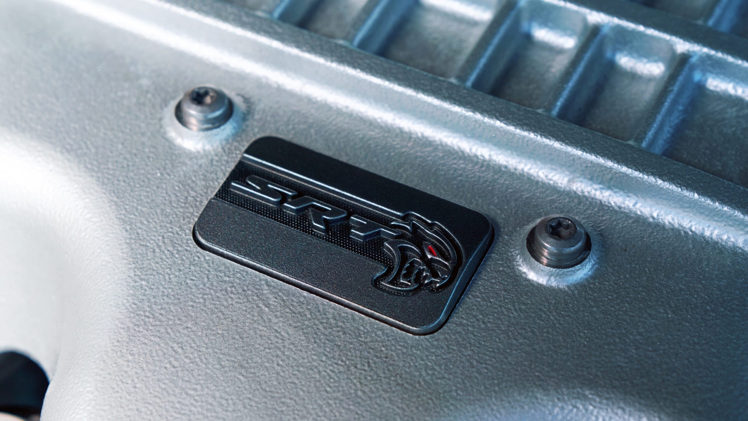
“2021 marks the year that Dodge is distilled to a pure performance brand with 700+ horsepower models available across the entire Dodge lineup,” said Tim Kuniskis, Global Head of Alfa Romeo and Head of Passenger Cars – Dodge, SRT, Chrysler and FIAT, FCA – North America. “The new 807-horsepower Hellcrate Redeye crate engine gives any pre-1976 vehicle owner another opportunity to become a member of the Dodge Brotherhood of Muscle by tapping into the Dodge//SRT power that wasn’t available then, but is now.”
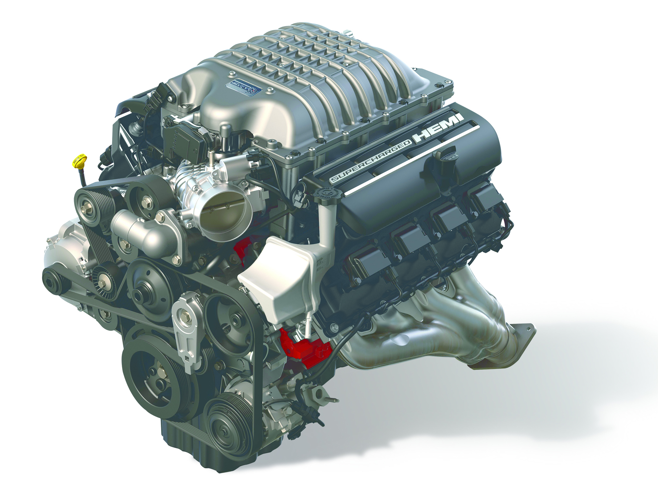
When compared to the standard Hellcrate motor offered by Mopar, the Hellcrate Redeye features several differences to allow it to achieve an additional 100 horsepower and 67 lb.-ft. of torque. The differences include the following…
- Larger supercharger – 2.7-liters versus 2.4-liters
- Increased boost pressure: 14.5 psi versus 11.6 psi
- Higher rpm limit: 6,500 rpm versus 6,200 rpm
- Forged alloy steel crankshaft with 90.9-millimeter stroke and revised balancing
- Induction-hardened crank bearing surfaces; individual journal optimized main bearing clearances
- 5150 alloy gun-drilled camshaft optimized for high rpm performance and decreased weight
- Forged high-strength alloy pistons; 30-micron increased piston-to-bore clearance
- Powder-forged connecting rods; upgraded shank and big end; revised ultra-high tensile fasteners
- 100% increase in piston-cooling jet flow
- Revised valve-spring design with a 33% increase in oiling for valve springs and rocker tips for improved lubrication and cooling
- Single-groove collets on valve stems for improved stability
- Oil pan and windage tray optimized for high acceleration – tested up to 1.8G
- Each engine is dyno-tested for 42 minutes before being shipped
Mopar’s complete crate engine package includes the supercharger with throttle body, fuel injectors, coil packs, water pump, front sump oil pan, and flexplate. The package does not include any electronics.
For those who are looking to mate a manual transmission to their Hellcrate Redeye, Mopar offers the parts you will need to get the job done.
- Flywheel (Part #05038113AD)
- Flywheel to Crankshaft Bolts (Part #06504398)
- Clutch and Pressure Plate Assembly (Part #05038769AB)
- Clutch to Flywheel Bolts (Part #06508880AA)
There is also a Front End Accessory Drive (FEAD) Kit (Part #77072492), which includes an alternator, belts, pulleys, power steering pump, and the mounting hardware. Mopar is working on a Controller Kit that should be available soon.
The Hellcrate Redeye crate engine (Part #68303091AA) has a U.S. Manufacturer’s Suggested Retail Price (MSRP) of $21,807. That is a $1,592 premium over the standard 707 horsepower Hellcrate. For Canadians, the Hellcrate Redeye has an MSRP of $37,010 (that is a premium of $2,900).
Ordering is now open and the motor will be shipped in an official Mopar wooden crate with the Hellcat Redeye logo. Included in the crate is in-depth information sheets with installation requirements and helpful tips. Mopar has also added that its newest crate motor is not intended for Marine applications. To learn more, visit www.cratehemi.com